
CSSのグラデーションで星柄の背景を作成しています。
まず星の周りを conic-gradient() で塗りつぶし、最後に残った星の形を linear-gradient() で塗っています。
conic-gradient() の開始位置は五角形の頂点となるため、座標(%で指定)を JavaScript で計算しスタイルをあてています。
星の大きさ(星の内側の五角形の外接円の半径による)や先端の角度も調整可能です。
script内のコメントに記載しています。
先端の角度38度の星形多角形(五芒星・一筆書きの星)
CODEPEN
「Run Pen」をクリックしてください。
See the Pen star pattern background 1 by blue moon (@blue-moon) on CodePen.
HTML
<body>
  <div id="star" class="star"></div>
</body>
CSS
body {
  margin: 0;
}

.star {
  width: 100%;
  height: 100vh;
  background-repeat: repeat;
}
JavaScript
const star = document.getElementById('star');

function posX(radius, coordAngle) {
  // グラデーションを%で指定するため、背景一コマを100×100とする
  if (radius > 50) return;

  // angle * (Math.PI / 180) → angleをラジアンに変換、
  // Math.cos() → 円の中心からのx座標を求め、
  // 座標の起点を左上端に変更(+50 or 50-)
  return (0 <= coordAngle <= 90 || 270 <= coordAngle <= 360) ?
    radius * Math.cos(coordAngle * (Math.PI / 180)) + 50 :
    50 - radius * Math.cos(coordAngle * (Math.PI / 180));
}

function posY(radius, coordAngle) {
  if (radius > 50) return;

  // Math.sin() → 円の中心からのy座標を求め、
  // 座標の起点を左上端に変更(50-)
  return 50 - radius * Math.sin(coordAngle * (Math.PI / 180));
}

const r = 16; // 背景一コマのサイズを100×100にした時の星の内側の五角形の外接円の半径を入力
const angle = 38; // 星の先端の角度を入力

const topRightX = posX(r, 54); // 360-90-72*3
const topRightY = posY(r, 54);
const bottomRightX = posX(r, 342); // 360-90+72
const bottomRightY = posY(r, 342);
const bottomX = posX(r, 270); // 360-90
const bottomY = posY(r, 270);
const bottomLeftX = posX(r, 198); // 360-90-72
const bottomLeftY = posY(r, 198);
const topLeftX = posX(r, 126); // 360-90-72*2
const topLeftY = posY(r, 126);
const topRightAngle = 360 - angle / 2;
const bottomRightAngle = topRightAngle + 72 - 360;
const bottomAngle = topRightAngle + 72 * 2 - 360;
const bottomLeftAngle = topRightAngle + 72 * 3 - 360;
const topLeftAngle = topRightAngle + 72 * 4 - 360;
// 線を滑らかにするため1度調整
const conic = `rgba(255, 255, 255, 0), #fff 1deg ${angle + 71}deg, rgba(255, 255, 255, 0) ${angle + 72}deg`;
// 隣接する背景1コマの隙間を埋める(ブラウザ等の環境によって隙間ができるため念のため)
const radial = 'radial-gradient(closest-side circle, rgba(255, 255, 255, 0) 99%, #fff 99%)';
// 星に適用したいグラデーションを入力
const linear = 'linear-gradient(135deg,hsl(55deg 100% 57%) 0%,hsl(50deg 100% 54%) 40%,hsl(350deg 100% 64%) 60%,hsl(339deg 100% 59%) 75%,hsl(331deg 100% 55%) 100%)';

star.style.background =
  `conic-gradient(from ${topRightAngle}deg at ${topRightX}% ${topRightY}%, ${conic}),
  conic-gradient(from ${bottomRightAngle}deg at ${bottomRightX}% ${bottomRightY}%, ${conic}),
  conic-gradient(from ${bottomAngle}deg at ${bottomX}% ${bottomY}%, ${conic}),
  conic-gradient(from ${bottomLeftAngle}deg at ${bottomLeftX}% ${bottomLeftY}%,${conic}),
  conic-gradient(from ${topLeftAngle}deg at ${topLeftX}% ${topLeftY}%, ${conic}),
   ${radial}, ${linear}`;
star.style.backgroundSize = '150px 150px' // 背景一コマのサイズを入力、正方形に
console.log(`topRight:${topRightX}, ${topRightY}`);
// topRight:59.404564036679574, 37.05572809000084
console.log(`bottomRight:${bottomRightX}, ${bottomRightY}`);
// bottomRight:65.21690426072246, 54.94427190999916
console.log(`bottom:${bottomX}, ${bottomY}`);
// bottom:50, 66
console.log(`bottomLeft:${bottomLeftX}, ${bottomLeftY}`);
// bottomLeft:34.78309573927754, 54.94427190999916
console.log(`topLeft:${topLeftX}, ${topLeftY}`);
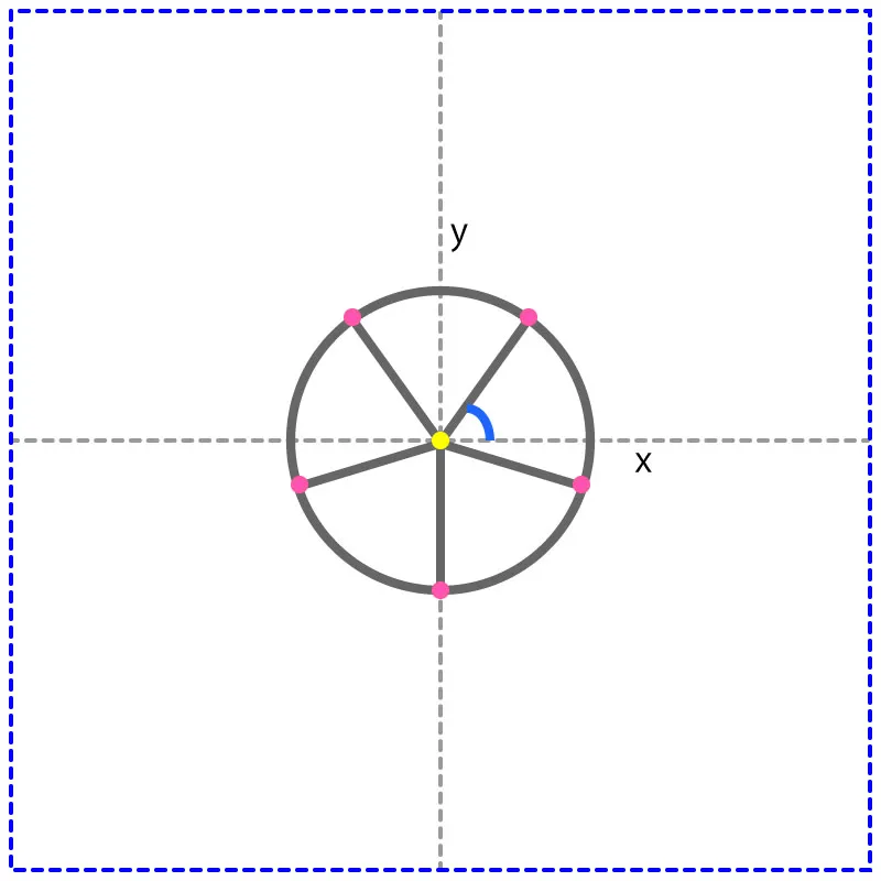
// topLeft:40.59543596332043, 37.05572809000084 JavaScript で、conic-gradient() の開始位置を計算しています。
下の図でいうと、青の角度(coordAngle)に対する黄色の点からのピンクの点の座標を求めた後、青の点線枠の左上からの座標に変換しています。
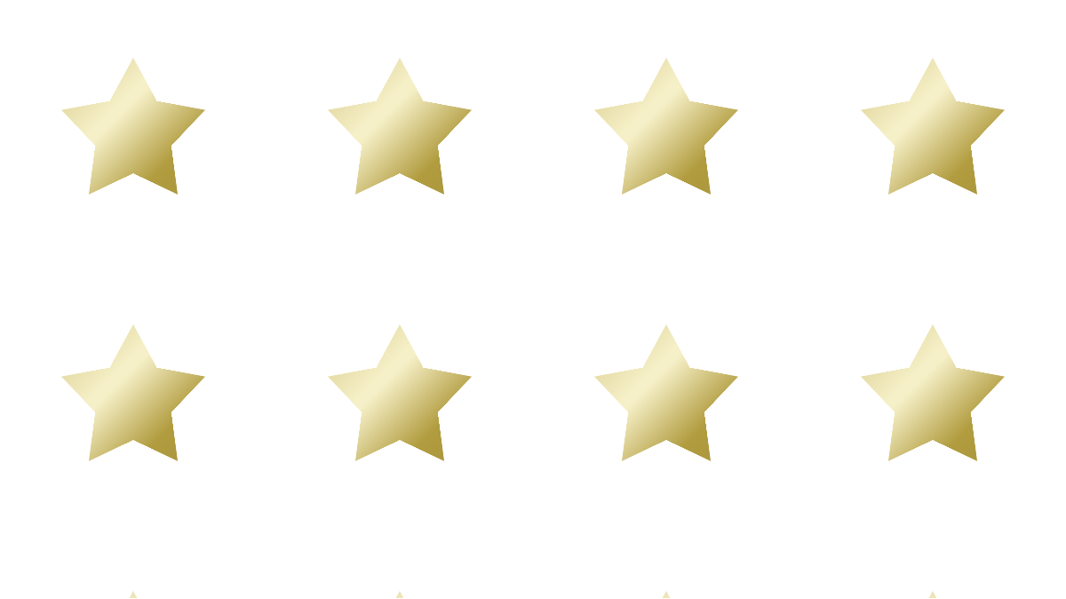
もう少し星の先端の角を大きくしたいです。
先端の角度48度の星
CODEPEN
「Run Pen」をクリックしてください。
See the Pen star pattern background 2 by blue moon (@blue-moon) on CodePen.
JavaScript
const star = document.getElementById('star');

function posX(radius, coordAngle) {
  if (radius > 50) return;
  return (0 <= coordAngle <= 90 || 270 <= coordAngle <= 360) ?
    radius * Math.cos(coordAngle * (Math.PI / 180)) + 50 :
    50 - radius * Math.cos(coordAngle * (Math.PI / 180));
}

function posY(radius, coordAngle) {
  if (radius > 50) return;
  return 50 - radius * Math.sin(coordAngle * (Math.PI / 180));
}

const r = 15.5; // 変更
const angle = 48; // 変更

const topRightX = posX(r, 54);
const topRightY = posY(r, 54);
const bottomRightX = posX(r, 342);
const bottomRightY = posY(r, 342);
const bottomX = posX(r, 270);
const bottomY = posY(r, 270);
const bottomLeftX = posX(r, 198);
const bottomLeftY = posY(r, 198);
const topLeftX = posX(r, 126);
const topLeftY = posY(r, 126);
const topRightAngle = 360 - angle / 2;
const bottomRightAngle = topRightAngle + 72 - 360;
const bottomAngle = topRightAngle + 72 * 2 - 360;
const bottomLeftAngle = topRightAngle + 72 * 3 - 360;
const topLeftAngle = topRightAngle + 72 * 4 - 360;
const conic = `rgba(255, 255, 255, 0), #001452 1deg ${angle + 71}deg, rgba(255, 255, 255, 0) ${angle + 72}deg`; // 変更
const radial = 'radial-gradient(closest-side circle, rgba(255, 255, 255, 0) 99%, #001452 99%)'; // 変更
const linear = 'linear-gradient(135deg, #e1ae00 0%, #faeec1 40%, #faeec1 42%, #c89b00 100%)'; // 変更

star.style.background =
  `conic-gradient(from ${topRightAngle}deg at ${topRightX}% ${topRightY}%, ${conic}),
  conic-gradient(from ${bottomRightAngle}deg at ${bottomRightX}% ${bottomRightY}%, ${conic}),
  conic-gradient(from ${bottomAngle}deg at ${bottomX}% ${bottomY}%, ${conic}),
  conic-gradient(from ${bottomLeftAngle}deg at ${bottomLeftX}% ${bottomLeftY}%,${conic}),
  conic-gradient(from ${topLeftAngle}deg at ${topLeftX}% ${topLeftY}%, ${conic}),
   ${radial}, ${linear}`;
star.style.backgroundSize = '150px 150px'
console.log(`topRight:${topRightX}, ${topRightY}`);
// topRight:59.110671410533335, 37.46023658718831
console.log(`bottomRight:${bottomRightX}, ${bottomRightY}`);
// bottomRight:64.74137600257488, 54.78976341281169
console.log(`bottom:${bottomX}, ${bottomY}`);
// bottom:50, 65.5
console.log(`bottomLeft:${bottomLeftX}, ${bottomLeftY}`);
// bottomLeft:35.25862399742512, 54.78976341281168
console.log(`topLeft:${topLeftX}, ${topLeftY}`);
// topLeft:40.88932858946667, 37.46023658718831もっと丸っこい星にもできます。
先端の角度60度の星
CODEPEN
「Run Pen」をクリックしてください。
See the Pen star pattern background 3 by blue moon (@blue-moon) on CodePen.
JavaScript
const star = document.getElementById('star');

function posX(radius, coordAngle) {
  if (radius > 50) return;
  return (0 <= coordAngle <= 90 || 270 <= coordAngle <= 360) ?
    radius * Math.cos(coordAngle * (Math.PI / 180)) + 50 :
    50 - radius * Math.cos(coordAngle * (Math.PI / 180));
}

function posY(radius, coordAngle) {
  if (radius > 50) return;
  return 50 - radius * Math.sin(coordAngle * (Math.PI / 180));
}

const r = 16; //変更
const angle = 60; //変更

const topRightX = posX(r, 54);
const topRightY = posY(r, 54);
const bottomRightX = posX(r, 342);
const bottomRightY = posY(r, 342);
const bottomX = posX(r, 270);
const bottomY = posY(r, 270);
const bottomLeftX = posX(r, 198);
const bottomLeftY = posY(r, 198);
const topLeftX = posX(r, 126);
const topLeftY = posY(r, 126);
const topRightAngle = 360 - angle / 2;
const bottomRightAngle = topRightAngle + 72 - 360;
const bottomAngle = topRightAngle + 72 * 2 - 360;
const bottomLeftAngle = topRightAngle + 72 * 3 - 360;
const topLeftAngle = topRightAngle + 72 * 4 - 360;
const conic = `rgba(255, 255, 255, 0), #1c1238 1deg ${angle + 71}deg, rgba(255, 255, 255, 0) ${angle + 72}deg`; //変更
const radial = 'radial-gradient(closest-side circle, rgba(255, 255, 255, 0) 99%, #1c1238 99%)'; //変更
const linear = 'linear-gradient(135deg, #b19c3f 0%, #f6f0c8 42%, #f6f0c8 44%, #b19c3f 62%, #9a8738 100%)'; //変更

star.style.background =
  `conic-gradient(from ${topRightAngle}deg at ${topRightX}% ${topRightY}%, ${conic}),
  conic-gradient(from ${bottomRightAngle}deg at ${bottomRightX}% ${bottomRightY}%, ${conic}),
  conic-gradient(from ${bottomAngle}deg at ${bottomX}% ${bottomY}%, ${conic}),
  conic-gradient(from ${bottomLeftAngle}deg at ${bottomLeftX}% ${bottomLeftY}%,${conic}),
  conic-gradient(from ${topLeftAngle}deg at ${topLeftX}% ${topLeftY}%, ${conic}),
   ${radial}, ${linear}`;
star.style.backgroundSize = '120px 120px' //変更
conic-gradient() の開始位置は先端角度38度時と同じ(半径が同じなので)