
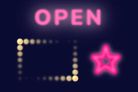
CSSで、ネオンサイン、順番に点灯するイルミネーション電球を作成しましたので、紹介いたします。
他に、SVGで作成した図形をネオン管のように仕上げたものもあります。
こちらは、テキストをネオン風に仕上げる方法とは全く別の方法で作成しています。
テキストを立体的に膨らませネオンサインに
CODEPEN
「Run Pen」をクリックしてください。
See the Pen neon sign by blue moon (@blue-moon) on CodePen.
HTMLファイル
<head>
  <!-- これより上は省略、以下3行で丸みのあるフォントを読み込み-->
  <link rel="preconnect" href="https://fonts.googleapis.com">
  <link rel="preconnect" href="https://fonts.gstatic.com" crossorigin>
  <link href="https://fonts.googleapis.com/css2?family=Nunito:wght@900&display=swap" rel="stylesheet">
  <link rel="stylesheet" href="style.css">
</head>
<body>
  <div class="neon">
    <p>OPEN</p>
  </div>
</body>
CSSファイル
body {
  background: #0b0b33;  /* 深い青紫系の色 */
  font-family: 'Nunito', sans-serif;  /* 丸みのある書体 */
}

.neon {
  margin: 0 auto;
  width: 90%;
  height: auto;
  display: flex;
  justify-content: center;
}

p {
  position: relative;
  width: min-content;
  background: #ff007f;  /* ビビッドな赤紫系の色 */
  font-size: 70px;
  letter-spacing: 0.1em;
  color: transparent;  /* 背景画像をテキストで切り抜くため、透明にする */
  -webkit-background-clip: text;
  background-clip: text;  /* 背景画像をテキストで切り抜く */
  animation: 3s linear infinite anim;
}

@keyframes anim {
  0%,100% { text-shadow: 0px 0px 8px rgba(255,178,216,0.9); }  /* 透明度を少し追加した淡い赤紫系の色 */
  50% { text-shadow: 0px 0px 4px rgba(255,178,216,0.5); }  /* 透明度をより増した淡い赤紫系の色 */
}

p::before {
  position: absolute;
  inset: 0px;  /* top: 0; left: 0; bottom: 0; right:0; をまとめて指定 */
  content: "OPEN";  /* 同じテキストを重ねる */
  color: #ffcce6;  /* とても淡い赤紫系の色 */
  z-index: -1;  /* 実像は見えない */
  filter: blur(25px);
}
テキストの内側に影(色)を追加
box-shadowにはinsetというキーワードを使用して内側に影を付けることができますが、テキストの場合にはこれが使用できません。そこで工夫が必要になります。
方法としてはいろいろあると思います。
今回は、テキストの背景色を切り抜き(実際にはこれがテキストカラーとなる)、その上でtext-shadowを設定することで、内側に色をつけています。
今回の場合は、影と言っても元の色より明るい色を内側に入れているため、膨らんだように見えます。
そして、この色の透明度をアニメーションで変化させています(アニメーションはなくてもよいと思いますが、参考として)。
ネオンの発光
わざわざ、疑似要素でテキストを重ねているのは、ネオンの発光を表現すためです。
pタグの疑似要素には、とても淡い赤紫系の色を設定していますが、実態は見えません。
この要素にfilter: blur()を設定することで、この色の背景色とのぼかし部分のみが見えています。
ボックスをイルミネーション電球で囲み、順番に点灯
CODEPEN
「Run Pen」をクリックしてください。
See the Pen light-box by blue moon (@blue-moon) on CodePen.
HTMLファイル
<body>
  <div class="light-box">

    <div class="light light-top">
      <span></span> <!-- これを合計10個作成、以下省略 -->
    </div>

    <div class="light light-left">
      <span></span> <!-- これを合計5個作成、以下省略 -->
    </div>

    <div class="light light-right">
      <span></span> <!-- これを合計5個作成、以下省略 -->
    </div>

    <div class=" light light-bottom">
      <span></span> <!-- これを合計10個作成、以下省略 -->
    </div>

  </div>
</body>
CSSファイル
body {
  background: #0b0b33;  /* 深い青紫系の色 */
}

.light-box {
  margin: 25px auto;
  width: 200px;  /* 電球の直径 × 10個 */
  display: flex;
  flex-wrap: wrap;
  justify-content: space-between;  /* ボックスの左右の縦並びの電球の列を、ボックスの両端に揃える */
}

.light-top, .light-bottom {
  width: 100%;  /* 他のflexbox子要素(左右の縦並びの電球)とは横並びさせず改行させる */
  display: flex;
}

.light-left, .light-right {
  display: flex;
  flex-direction: column;  /* 左右の電球は縦並びにする */
}

.light span {
  display: inline-block;
  width: 20px;
  height: 20px;
  border-radius: 50%;  /* 円形に */
  background: radial-gradient(closest-corner at 30% 30%, #fff, #fff7a4, #ffd489); /* 放射状グラデーション */
  opacity: 0;  /* 初期値、これを指定しないとページを開いた瞬間は全ての電球が点灯した状態となる */
  animation: gradation 1.5s linear infinite;
}

@keyframes gradation {
  0%, 100% { /* 電球が消灯している時 */
    filter: blur(8px);  /* 消灯にかけてぼかしを大きくし、残像を残す */
    transform: scale(0.3);  /* 透明で見えないが、不自然にならに程度にサイズは残す */
    opacity: 0;
  }
  50% {  /* 電球が点灯している時 */
    filter: blur(0.5px); /* 発光しているようにほんの少し背景色とぼかす */
    transform: scale(1);
    opacity: 1;
  }
}

.light-top span:nth-child(2),
.light-bottom span:nth-child(9) {
  animation-delay: 0.1s;
}

.light-top span:nth-child(3),
.light-bottom span:nth-child(8) {
  animation-delay: 0.2s;
}

.light-top span:nth-child(4),
.light-bottom span:nth-child(7) {
  animation-delay: 0.3s;
}

.light-top span:nth-child(5),
.light-bottom span:nth-child(6) {
  animation-delay: 0.4s;
}

.light-top span:nth-child(6),
.light-bottom span:nth-child(5) {
  animation-delay: 0.5s;
}

.light-top span:nth-child(7),
.light-bottom span:nth-child(4) {
  animation-delay: 0.6s;
}

.light-top span:nth-child(8),
.light-bottom span:nth-child(3) {
  animation-delay: 0.7s;
}

.light-top span:nth-child(9),
.light-bottom span:nth-child(2) {
  animation-delay: 0.8s;
}

.light-top span:nth-child(10),
.light-bottom span:nth-child(1) {
  animation-delay: 0.9s;
}

.light-left span:nth-child(5),
.light-right span:nth-child(1) {
  animation-delay: 1s;
}

.light-left span:nth-child(4),
.light-right span:nth-child(2) {
  animation-delay: 1.1s;
}

.light-left span:nth-child(3),
.light-right span:nth-child(3) {
  animation-delay: 1.2s;
}

.light-left span:nth-child(2),
.light-right span:nth-child(4) {
  animation-delay: 1.3s;
}

.light-left span:nth-child(1),
.light-right span:nth-child(5) {
  animation-delay: 1.4s;
}
電球のグラデーション
各電球に、グラデーション塗りすることで立体感を演出しています。
ここでは、radial-gradient()という放射状にグラデーションする方法を使用しています。
グラデーションの内容は下記の通りです。
グラデーションされる範囲に一番近いコーナーの上から30%、左から30%を中心とし、#fff(白)、#fff7a4(淡い黄系の色)、#ffd489(少しオレンジがかった、軽い黄系の色)の順で、放射状にグラデーションしています。
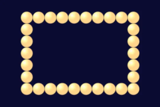
因みに、アニメーションする前(全ての電球が点灯している状態)の画像は下記のように見えます。
色を多少変更すれば、真珠もボーリング玉等もできそうです。
このradial-gradient()は、グラデーション範囲や中心点を変更することが可能です。
詳細は、下記記事でも解説しています。
また、CSSのfileterプロパティのblur()により、電球と背景の境界をぼかし発光しているように演出しています。
順番に点灯するアニメーション
電球は横に10個、縦に5個並べ、topとrightで15個、bottomとleftで15個、それぞれを1つのグループとしてアニメーションしています。
そして、アニメーション時間が1.5秒なので、時計回りに0.1秒ずつアニメーション開始(電球点灯)時間を遅らせています。
bottomとleftの組み合わせの方は、最後のspanタグからアニメーションを開始することで、全体的に連続しているように見えています。
SVGで星を描きネオン風に
CODEPEN
「Run Pen」をクリックしてください。
See the Pen neon_star by blue moon (@blue-moon) on CodePen.
HTMLファイル
<body>
  <svg width="200" height="200" viewBox="0 0 100 100">

    <!-- 本体の発光部分 -->
    <polygon points="50 14 55 30 70 30 60 40 64 54 50 45 36 54 40 40 30 30 45 30"
       fill="transparent" stroke-width="8" stroke-linejoin="round"/>

    <!-- 本体の輪郭部分 -->
    <polygon points="50 14 55 30 70 30 60 40 64 54 50 45 36 54 40 40 30 30 45 30"
       fill="transparent" stroke-width="9" stroke-linejoin="round"/>

    <!-- 本体の部分 -->
    <polygon points="50 14 55 30 70 30 60 40 64 54 50 45 36 54 40 40 30 30 45 30"
       fill="transparent" stroke-width="7" stroke-linejoin="round"/>

    <!-- 本体の中心線 -->
    <polygon points="50 14 55 30 70 30 60 40 64 54 50 45 36 54 40 40 30 30 45 30"
       fill="transparent" stroke-width="1.5" stroke-linejoin="round"/>

  </svg>
</body>
星の描画
SVGで4つの星を全て同じ座標点に描画しています。
そして、それぞれの線(stroke)の幅を変更し、色等はCSSで追加しています。
SVGで描かれた図形は、後から描かれた図形が覆いかぶさるようになります。
CSSのz-indexプロパティは効かないです。
よって、最背面に表示するものから順に描画する必要があります。
多角形の丸み
HTMLタグに記述している、stroke-linejoinプロパティは、多角形の角(2本の線の接続部分)をどのようにするか指定します。
ここで、roundを指定することで丸みを持たせています。
他には、miter、bevelという値があります。
類似のプロパティに、stroke-linecapというものがありますが、こちらは単独の線(line)の端をどのようにするかを指定します。
詳細は、下記をご覧ください。
MDN > SVG教本 > 塗りつぶしとストローク
図形の大きさ
SVGのキャンパスの大きさは、200px × 200pxですが、viewBoxの設定を100px × 100pxにすることによって、実際には画像を2倍に表示させています。
詳細は、下記をご覧ください。
MDN > SVG教本 > 配置
CSSファイル
/* これより上省略 */
polygon:nth-child(1) {
  stroke: #ffcce6;  /* とても淡い赤紫系の色 */
  filter: blur(20px);  /* 発光を演出している箇所、ぼかし幅はかなり大きい */
}

polygon:nth-child(2) {  /* 本体の輪郭部分 */
  stroke: #cc0066;  /* あざやかな赤紫系の色 */
  filter: blur(1.5px);
}

polygon:nth-child(3) {  /* 本体の大半を占める色 */
  stroke: #ff007f;  /* 2番目よりも明るい、あざやかな赤紫系の色 */
}

polygon:nth-child(4) {  /* 本体の中心線 */
  stroke: #fff;  /* 白 */
  filter: blur(2.2px);
}
同じ座標上に描画された、幅の異なる星のラインの色とぼかしを変化させることで、立体的、且つ発光しているように見えています。
なお、このネオンにはアニメーションはつけていません。