
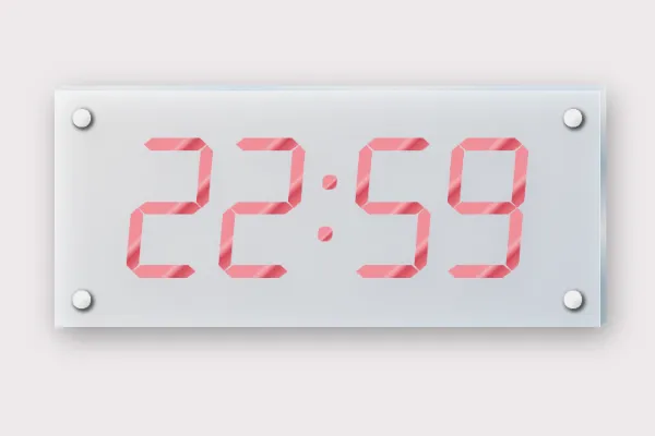
CSSで透け感のあるガラスやアクリル板のようなプレートを作成し、壁に取る付けてあるかのようなイメージにしました。文字を彫ったように表示させるものと、時刻をデジタル表示させるもの、2つあります。
デジタル時計表示は下記でも紹介しています。
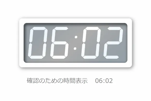
下記は後者のイメージです。
使用するファイル
- HTMLファイル
- CSSファイル(SCSSを使用しています。)
ベンダープレフィックスは省略しています。 - JSファイル(時刻を表示させるバージョンのみ)
jQueryを事前に読み込んでおいてください。
透明プレートに彫ったような文字を表示
CODEPENで実装と確認
「Run Pen」をクリックしてください。
See the Pen glass-plate by blue moon (@blue-moon) on CodePen.
HTMLファイル
<body>
  <div class="container">
    <div class="plate">
      <div class="glass">
        <div class="glass-top"></div>
        <div class="glass-right"></div>
      </div>
      <div class="pin top-left"></div>
      <div class="pin top-right"></div>
      <div class="pin bottom-left"></div>
      <div class="pin bottom-right"></div>
      <div class="phrase">
        <p>Glass plate</p>
      </div>
    </div>
  </div>
</body>
CSSファイル
プレート全体
body {
  background-color: blue;
}

.container {
  margin: 30px auto;
  width: 300px;
  height: 200px;
}

.plate {
  position: relative;
  margin: 5% auto;
  width: 240px;
  height: 180px;
  background-image: linear-gradient(-225deg, rgba(255, 255, 255, 0.6) 0%, rgba(223, 233, 243, 0.6) 100%);
  filter: drop-shadow(3px 5px 8px rgba(0, 0, 0, 0.5));
}

.glass {
  width: 100%;
  height: 100%;
  opacity: 0.5;
}

.glass-top,
.glass-right {
  position: absolute;
  background-color: #007fff;
  box-sizing: border-box;
}

.glass-top {
  top: -3px;
  width: 100%;
  height: 3px;
  border-bottom: solid 0.5px #dbffff;
  border-right: solid 0.5px #dbffff;
  transform: skewX(-45deg);
  transform-origin: bottom left;
  background: linear-gradient(135deg, #ebf1f6 0%, #f9fdff 10%, rgba(213, 235, 251, 0.99) 33%, rgba(247, 252, 255, 0.98) 60%, rgba(213, 235, 251, 0.97) 82%, rgba(213, 235, 251, 0.97) 100%);
}

.glass-right {
  right: -3px;
  width: 3px;
  height: 100%;
  border-left: solid 0.5px #dbffff;
  border-bottom: solid 0.5px #afcccc;
  transform: skewY(-40deg);
  transform-origin: top left;
  background: linear-gradient(-135deg, #ebf1f6 0%, #f9fdff 10%, #89a9bf 33%, #f7fcff 60%, #89a9bf 82%, #89a9bf 100%, #d5ebfb 100%);
}

.pin {
  position: absolute;
  width: 10px;
  height: 10px;
  border-radius: 50%;
  background-image: linear-gradient(135deg, #b0b0b0 0%, #b5b5b5 1%, #d9d9d9 20%, #efefef 48%, #d9d9d9 75%, #bcbcbc 100%);
  box-shadow: 1px 1px 2px 1px rgba(0, 0, 0, 0.65), 2px 2px 4px 0px #f3f3f3 inset;
}

.top-left {
  top: 10px;
  left: 10px;
}

.top-right {
  top: 10px;
  right: 10px;
}

.bottom-left {
  bottom: 10px;
  left: 10px;
}

.bottom-right {
  bottom: 10px;
  right: 10px;
}
プレートの文字部分
.phrase {
  position: absolute;
  top: 0;
  left: 0;
  width: 100%;
  height: 100%;
  display: table;
  backdrop-filter: opacity(0.5);
}

.phrase p {
  display: table-cell;
  vertical-align: middle;
  text-align: center;
  font-size: 20px;
  font-weight: 700;
  color: transparent;
  background-color: rgba(0, 0, 0, 0.7);
  background-clip: text;
  text-shadow: 0.7px 1px 1px #fff;
}
補足説明
プレートに透明度のある色でグラデーションをすることで透明感を出し、filter: drop-shadow(●●●)で影をつけ、壁に取り付けているように見えるように工夫しました。
透明度や影はお好みで調整してください。
テキストにbackground-clip: text; を使って背景色(黒)をテキストの形に切り取ったうえで、テキストにtext-shadowプロパティによって、プレートに彫ったように見えるようにしています。
透明プレートに現在時刻をデジタル表示
CODEPEN で実装と確認
See the Pen glass plate clock by blue moon (@blue-moon) on CodePen.
HTMLファイル
<body>
  <div class="container">
    <div class="plate">
      <div class="glass">
        <div class="glass-top"></div>
        <div class="glass-right"></div>
      </div>
      <div class="pin top-left"></div>
      <div class="pin top-right"></div>
      <div class="pin bottom-left"></div>
      <div class="pin bottom-right"></div>
      <div class="clock">
        <ul>
          <li id="hours-first">
            <div class="bar">
              <div class="top"></div>
              <div class="middle"></div>
              <div class="bottom"></div>
              <div class="left-top"></div>
              <div class="left-bottom"></div>
              <div class="right-top"></div>
              <div class="right-bottom"></div>
            </div>
          </li>
          <li id="hours-second">
            <div class="bar">
              <div class="top"></div>
              <div class="middle"></div>
              <div class="bottom"></div>
              <div class="left-top"></div>
              <div class="left-bottom"></div>
              <div class="right-top"></div>
              <div class="right-bottom"></div>
            </div>
          </li>
          <li class="colon">
            <div class="colon-top"></div>
            <div class="colon-bottom"></div>
          </li>
          <li id="minutes-first">
            <div class="bar">
              <div class="top"></div>
              <div class="middle"></div>
              <div class="bottom"></div>
              <div class="left-top"></div>
              <div class="left-bottom"></div>
              <div class="right-top"></div>
              <div class="right-bottom"></div>
            </div>
          </li>
          <li id="minutes-second">
            <div class="bar">
              <div class="top"></div>
              <div class="middle"></div>
              <div class="bottom"></div>
              <div class="left-top"></div>
              <div class="left-bottom"></div>
              <div class="right-top"></div>
              <div class="right-bottom"></div>
            </div>
          </li>
        </ul>
      </div>
    </div>
  </div>
</body>
CSSファイル
プレート全体
body {
  background-color: #eeeaec;
}

.container {
  margin: 30px auto;
  width: 300px;
  height: 200px;
}

.plate {
  position: relative;
  margin: 5% auto;
  width: 300px;
  height: 130px;
  background-image: linear-gradient(-225deg, rgba(255, 255, 255, 0.7) 0%, rgba(223, 233, 243, 0.7) 100%);
  filter: drop-shadow(3px 5px 8px rgba(0, 0, 0, 0.5));
}

.glass {
  width: 100%;
  height: 100%;
  opacity: 0.5;
}

.glass-top,
.glass-right,
.pin {
  position: absolute;
}

.glass-top,
.glass-right {
  background-color: #007fff;
}

.glass-top {
  top: -3px;
  width: 100%;
  height: 3px;
  border-bottom: solid 0.5px #dbffff;
  border-right: solid 0.5px #dbffff;
  background: linear-gradient(135deg, #ebf1f6 0%, #f9fdff 10%, rgba(213, 235, 251, 0.99) 33%, rgba(247, 252, 255, 0.98) 60%, rgba(213, 235, 251, 0.97) 82%, rgba(213, 235, 251, 0.97) 100%);
}

.glass-right {
  right: -3px;
  width: 3px;
  height: 100%;
  border-left: solid 0.5px #dbffff;
  border-bottom: solid 0.5px #afcccc;
  background: linear-gradient(-135deg, #ebf1f6 0%, #f9fdff 10%, #89a9bf 33%, #f7fcff 60%, #89a9bf 82%, #89a9bf 100%, #d5ebfb 100%);
}

.pin {
  position: absolute;
  width: 10px;
  height: 10px;
  border-radius: 50%;
  background-image: linear-gradient(135deg, #b0b0b0 0%, #b5b5b5 1%, #d9d9d9 20%, #efefef 48%, #d9d9d9 75%, #bcbcbc 100%);
  box-shadow: 1px 1px 2px 1px rgba(0, 0, 0, 0.65), 2px 2px 4px 0px #f3f3f3 inset;
}

.top-left {
  top: 10px;
  left: 10px;
}

.top-right {
  top: 10px;
  right: 10px;
}

.bottom-left {
  bottom: 10px;
  left: 10px;
}

.bottom-right {
  bottom: 10px;
  right: 10px;
}
時刻表示部分
.clock {
  position: absolute;
  top: 20%;
  left: 10%;
  width: 80%;
  height: 60%;
}

.clock ul {
  margin: 0 auto;
  padding: 0;
  width: 224px;
  height: 77px;
  list-style: none;
  display: flex;
  justify-content: space-around;
  transform: skewX(-5deg);
}

.clock ul li {
  width: 18%;
  height: 100%;
}
数字を構成するバーの部分
.bar {
  position: relative;
  width: 100%;
  height: 100%;
}

.bar .top,
.bar .middle,
.bar .bottom,
.bar .left-top,
.bar .left-bottom,
.bar .right-top,
.bar .right-bottom {
  position: absolute;
  display: none;
  -webkit-transition: all 0.5s ease-in-out;
  transition: all 0.5s ease-in-out;
  background: linear-gradient(135deg, #f18e99 0%, #f18e99 50%, #efaeb5 57%, #f18e99 62%, #d24b5a 70%, #f18e99 100%);
}

.bar .top,
.bar .middle,
.bar .bottom {
  left: 7%;
  width: 86%;
  height: 7px;
  clip-path: polygon(12.5% 0, 87.5% 0, 100% 50%, 87.5% 100%, 12.5% 100%, 0% 50%);
}

.bar .left-top,
.bar .left-bottom,
.bar .right-top,
.bar .right-bottom {
  height: 45%;
  width: 7px;
  clip-path: polygon(50% 0, 100% 10%, 100% 90%, 50% 100%, 0 90%, 0 10%);
}

.bar .top {
  top: 0;
}

.bar .middle {
  top: calc(50% - 3.5px);
}

.bar .bottom {
  bottom: 0;
}

.bar .left-top {
  top: 5%;
  left: -2.5%;
}

.bar .left-bottom {
  bottom: 5%;
  left: -2.5%;
}

.bar .right-top {
  top: 5%;
  right: -2.5%;
}

.bar .right-bottom {
  bottom: 5%;
  right: -2.5%;
}
各数字においてどのバーを表示させるか
.zero .bar div:not(.middle) {
  display: block;
}

.one .bar .right-top,
.one .bar .right-bottom {
  display: block;
}

.two .bar .top,
.two .bar .middle,
.two .bar .bottom,
.two .bar .left-bottom,
.two .bar .right-top {
  display: block;
}

.three .bar .top,
.three .bar .middle,
.three .bar .bottom,
.three .bar .right-top,
.three .bar .right-bottom {
  display: block;
}

.four .bar .middle,
.four .bar .left-top,
.four .bar .right-top,
.four .bar .right-bottom {
  display: block;
}

.five .bar .top,
.five .bar .middle,
.five .bar .bottom,
.five .bar .left-top,
.five .bar .right-bottom {
  display: block;
}

.six .bar div:not(.right-top) {
  display: block;
}

.seven .bar .top,
.seven .bar .right-top,
.seven .bar .right-bottom {
  display: block;
}

.eight .bar div {
  display: block;
}

.nine .bar div:not(.left-bottom) {
  display: block;
}

.colon {
  width: 5%;
  display: flex;
  flex-direction: column;
  justify-content: space-evenly;
  align-items: center;
  z-index: 5;
}

.colon .colon-top,
.colon .colon-bottom {
  width: 8px;
  height: 8px;
  border-radius: 3px;
  background: linear-gradient(135deg, #f18e99 0%, #f18e99 50%, #efaeb5 57%, #f18e99 62%, #d24b5a 70%, #f18e99 100%);
}
JSファイル
const time = () => {  // 時刻表示の関数作成

  // 2桁表記(8:10 を 08:10 とするための関数)
  const toDoubleNum = function(num) {
    num += "";
    if (num.length === 1) {
      num = "0" + num;
    }
   return num;
  };

  const now = new Date(); //現在の日時を取得
  const h = toDoubleNum(now.getHours()); //時間のみ取得し2桁に
  const m = toDoubleNum(now.getMinutes()); //分のみ取得し2桁に

  const h1 = (h).slice(0,1); //1桁目の数値を取得
  const h2= (h).slice(-1); //2桁目の数値を取得
  const m1 = (m).slice(0,1);
  const m2= (m).slice(-1);

  // デジタル表示と実際の時間確認のため表示
  $('.time').text( h1 + h2 + ':' + m1 + m2 );

  const h1elem = $('#hours-first');
  const h2elem = $('#hours-second');
  const m1elem = $('#minutes-first');
  const m2elem = $('#minutes-second');

  // 時間の各数値と対応するクラスの組合わせのオブジェクトを作成
  const obj = [
    { time: h1, elem: h1elem },
    { time: h2, elem: h2elem },
    { time: m1, elem: m1elem },
    { time: m2, elem: m2elem },
  ];

  // クラスを付与する関数を作成
  function add (time, elem) {
    elem.removeClass(); //現在のクラスはここで一旦削除
    if (time == 1) {
      elem.addClass('one');
    } else if (time == 2) {
      elem.addClass('two');
    } else if (time == 3) {
      elem.addClass('three');
    } else if (time == 4) {
      elem.addClass('four');
    } else if (time == 5) {
      elem.addClass('five');
    } else if (time == 6) {
      elem.addClass('six');
    } else if (time == 7) {
      elem.addClass('seven');
    } else if (time == 8) {
      elem.addClass('eight');
    } else if (time == 9) {
      elem.addClass('nine');
    } else {
      elem.addClass('zero');
    }
  }

  // 先に作成したオブジェクト対して関数を実行
  $.each(obj, function(index, val) {
    add(val.time, val.elem);
  });

};
time();  // 時刻表示の関数呼び出し

//最初に時刻表示した後は、1分後に表示を変更する
const timeUpdate = () => {  // 1分後に時刻表示の関数を呼び出す関数作成
  time();
  setTimeout(timeUpdate, 60000);  // 1分間隔
};

timeUpdate();
補足説明
JSファイルでは、冒頭で紹介した記事と内容が被りますが、以下のことを行っています。
- 現在時刻を取得(冒頭に記述したsetIntervalの中で繰り返し行う処理を記述し、最後に間隔時間を設定)
- 取得した現在時刻のうち、使用する時間と分を2桁表示にし、それぞれ1文字ずつに分割
- 各数値とそれを表示するHTML要素を組み合わせたオブジェクトを作成
- バーを表示するためのクラスを付与する関数を作成
- 作成しておいたオブジェクトに関数を渡し、ループ処理 eachメソッド
最後に
今回、グラデーションを複数使用しています。
「webGradients」は参考になります。既に作られたグラデーションを円の形(グラデーションがついているので球体に見えます)で確認でき、CSSをそのままコピーできます。
お好みのグラデーションを見つけてアレンジしてみてはいかがでしょうか。但し、はまるときりがないのでご注意ください。