
SVG で多角形を描画する polygon タグの points 属性の値(座標)を JavaScript で計算しています。
それは2つの五角形の頂点で、五角形の外接円を元に計算できます(本文中の図参照)。
そのため、円の半径を変更すると星の大きさや角度も調整可能になります。
CSS のグラデーションで描画するのと比べて、線が滑らかでアニメーション等のバリエーションもあり、可能性が広がります。

SVGで星を1つ作成
See the Pen SVG star fill by blue moon (@blue-moon) on CodePen.
HTML
  <svg version="1.1" xmlns="http://www.w3.org/2000/svg" width="100%" height="100vh">
    <defs>
      <linearGradient id="gradient" x1="0" x2="0.6" y1="0" y2="1">
        <stop offset="0%" stop-color="#b19c3f" />
        <stop offset="38%" stop-color="#f6f0c8" />
        <stop offset="58%" stop-color="#f6f0c8" />
        <stop offset="80%" stop-color="#b19c3f" />
        <stop offset="100%" stop-color="#9a8738" />
      </linearGradient>
    </defs>
    <polygon id="star" fill="url(#gradient)" />
  </svg>
polygon タグの points 属性の値は JavaScript で計算するため、ここには記述していないです。
また、fill 属性で defs タグで定義した linearGradient を参照しています。
JavaScript
const star = document.getElementById('star');
const R = 40; // 大きい方の円の半径
const r = 20; // 小さい方の円の半径

// 100×100の座標の中に星を描く
function X(radius, coordAngle) {
  if (radius > 50) return;
// 円の半径と角度から中心からの座標を計算し、
// 左上からの座標に変換後、小数点の桁数を落とす
  return (0 <= coordAngle <= 90 || 270 <= coordAngle <= 360) ?
    (radius * Math.cos(coordAngle * (Math.PI / 180)) + 50).toFixed(3) :
    (50 - radius * Math.cos(coordAngle * (Math.PI / 180))).toFixed(3);
}

function Y(radius, coordAngle) {
  if (radius > 50) return;
  return (50 - radius * Math.sin(coordAngle * (Math.PI / 180))).toFixed(3);
}

// 計算した座標をHTMLのpoligonタグのpoints属性の値にセット
star.setAttribute('points',
  `${X(R, 90)},${Y(R, 90)}
  ${X(r, 54)},${Y(r, 54)}
  ${X(R, 18)},${Y(R, 18)}
  ${X(r, 342)},${Y(r, 342)}
  ${X(R, 306)},${Y(R, 306)}
  ${X(r, 270)},${Y(r, 270)}
  ${X(R, 234)},${Y(R, 234)}
  ${X(r, 198)},${Y(r, 198)}
  ${X(R, 162)},${Y(R, 162)}
  ${X(r, 126)},${Y(r, 126)}`);
求めた polygon タグの属性 points の値は、下記の図の青とピンクの点の座標になります。
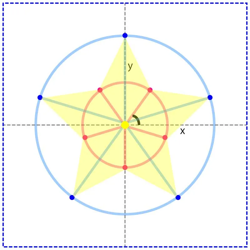
つまり、星の大きさと形は円の半径に依存します。
R = 40、r = 20の結果、points 属性の値は下記のようになります。
<polygon id="star" fill="url(#gradient)"
points="50.000,10.000
        61.756,33.820
        88.042,37.639
        69.021,56.180
        73.511,82.361
        50.000,70.000
        26.489,82.361
        30.979,56.180
        11.958,37.639
        38.244,33.820">
</polygon>
塗りつぶしなしのラインのみの星
See the Pen SVG star stroke by blue moon (@blue-moon) on CodePen.
HTML
  <svg version="1.1" xmlns="http://www.w3.org/2000/svg" width="100%" height="100vh">
    <defs>
      <linearGradient id="gradient" x1="0" x2="0.6" y1="0" y2="1">
        <stop offset="0%" stop-color="#b19c3f" />
        <stop offset="38%" stop-color="#f6f0c8" />
        <stop offset="58%" stop-color="#f6f0c8" />
        <stop offset="80%" stop-color="#b19c3f" />
        <stop offset="100%" stop-color="#9a8738" />
      </linearGradient>
    </defs>
    <polygon id="star" fill="transparent" stroke="url(#gradient)" stroke-width="4" />
  </svg>
fillを透明にし、stroke で linearGradient を参照しています。
JavaScript
const R = 42;
const r = 25;
円の半径を変更しました。
輝きをプラス
See the Pen SVG star shadow by blue moon (@blue-moon) on CodePen.
HTML
  <svg version="1.1" xmlns="http://www.w3.org/2000/svg" width="100%" height="100vh">
    <defs>
      <linearGradient id="gradient" x1="0" x2="0.6" y1="0" y2="1">
        <stop offset="0%" stop-color="#b19c3f" />
        <stop offset="38%" stop-color="#f6f0c8" />
        <stop offset="58%" stop-color="#f6f0c8" />
        <stop offset="80%" stop-color="#b19c3f" />
        <stop offset="100%" stop-color="#9a8738" />
      </linearGradient>
    </defs>
    <polygon id="star" fill="url(#gradient)" />
    <filter id="blur">
      <feGaussianBlur in="SourceGraphic" stdDeviation="6" />
    </filter>
    <use href="#star" x="0" filter="url(#blur)" />
  </svg>
use タグで同じ星を参照したもの(複製を作成)に、filter で作成したぼかしフィルターを参照し、元の星の背後に重ねています。
JavaScript
const R = 38;
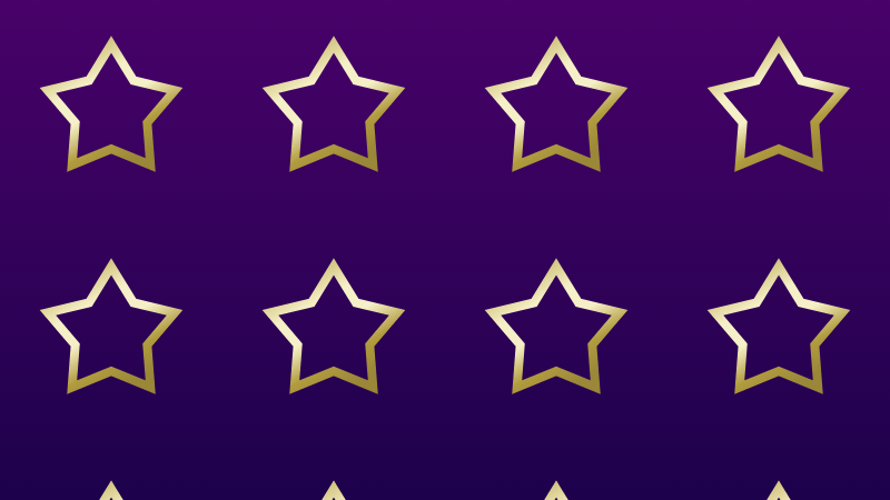
const r = 20;繰り返して背景模様
See the Pen SVG star pattern by blue moon (@blue-moon) on CodePen.
HTML
  <svg version="1.1" xmlns="http://www.w3.org/2000/svg" width="100%" height="100vh">
    <defs>
      <linearGradient id="gradient" x1="0" x2="0.6" y1="0" y2="1">
        <stop offset="0%" stop-color="#b19c3f" />
        <stop offset="38%" stop-color="#f6f0c8" />
        <stop offset="58%" stop-color="#f6f0c8" />
        <stop offset="80%" stop-color="#b19c3f" />
        <stop offset="100%" stop-color="#9a8738" />
      </linearGradient>
    </defs>
    <pattern id="Pattern" x="0" y="0" width="100" height="100" patternUnits="userSpaceOnUse">
      <polygon id="star" fill="url(#gradient)" />
    </pattern>
    <rect fill="url(#Pattern)" x="0" y="0" width="100%" height="100%" />
  </svg>
pattern で定義したオブジェクトを、画面いっぱいに描画した四角形の fill で参照しています。
JavaScript
const R = 26;
const r = 17;
回転アニメーション
See the Pen SVG star rotate by blue moon (@blue-moon) on CodePen.
HTML
  <svg version="1.1" xmlns="http://www.w3.org/2000/svg" width="100%" height="100vh">
    <defs>
      <linearGradient id="gradient" x1="0" x2="0.6" y1="0" y2="1">
        <stop offset="0%" stop-color="#b19c3f" />
        <stop offset="38%" stop-color="#f6f0c8" />
        <stop offset="58%" stop-color="#f6f0c8" />
        <stop offset="80%" stop-color="#b19c3f" />
        <stop offset="100%" stop-color="#9a8738" />
      </linearGradient>
    </defs>
    <pattern id="Pattern" x="0" y="0" width="100" height="100" patternUnits="userSpaceOnUse">
      <clipPath id="clip">
        <polygon id="star">
          <animateTransform attributeName="transform" type="rotate" from="0 50 50" to="360 50 50" dur="10s"
            repeatCount="indefinite" />
        </polygon>
      </clipPath>
      <rect x="0" y="0" width="100" height="100" fill="url(#gradient)" clip-path="url(#clip)" />
    </pattern>
    <rect fill="url(#Pattern)" x="0" y="0" width="100%" height="100%" />
  </svg>
単純に星を回転すると、グラデーションの向きも一緒に回転してしまいます。
今回の場合はグラデーションの方向は変更したくないため、一工夫しています。
グラデーションをかけている図形(静止)を、回転する星の形で clipPath への参照でクリッピングしています。
JavaScript
const R = 30;
const r = 17;
グラデーションをアニメーション
See the Pen SVG star gradient transform by blue moon (@blue-moon) on CodePen.
HTML
  <svg version="1.1" xmlns="http://www.w3.org/2000/svg" width="100%" height="98vh">
    <defs>
      <linearGradient id="gradient" x1="0" x2="0.6" y1="0" y2="1">
        <stop offset="0%" stop-color="#e0d18f" />
        <stop offset="45%" stop-color="#fffbe2" />
        <stop offset="55%" stop-color="#fffbe2" />
        <stop offset="100%" stop-color="#e0d18f" />
        <animateTransform attributeName="gradientTransform" type="translate" from="0 -1" to="2 1" dur="4s"
          repeatCount="indefinite" />
      </linearGradient>
    </defs>
    <pattern id="Pattern" x="0" y="0" width="100" height="100" patternUnits="userSpaceOnUse">
      <polygon id="star" fill="url(#gradient)" />
      <filter id="blur">
        <feGaussianBlur in="SourceGraphic" stdDeviation="6" />
      </filter>
      <use href="#star" x="0" filter="url(#blur)" />
    </pattern>
    <rect fill="url(#Pattern)" x="0" y="0" width="100%" height="100%" />
  </svg>
gradientTransform でグラデーションにアニメーションを設定しています。