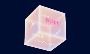
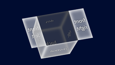
マウスオーバーすると一つの面(フタ)が開く3D空間上に配置された立方体の作成方法です。
面が二つに分かれていて両開きに開くものと、片開きのものがあります。
両開き
CODEPEN
「Run Pen」をクリックしてください。
See the Pen box with lid 1 by blue moon (@blue-moon) on CodePen.
HTML
<body>
  <div class="cube">
    <div class="surface front">
      <div class="front-left">
        <p>front<br>left</p>
      </div>
      <div class="front-right">
        <p>front<br>right</p>
      </div>
    </div>
    <div class="surface right">
      <p>right</p>
    </div>
    <div class="surface back">
      <p>back</p>
    </div>
    <div class="surface left">
      <p>left</p>
    </div>
    <div class="surface top">
      <div class="cover-top-right"></div>
      <p>top</p>
      <div class="cover-left-bottom"></div>
    </div>
    <div class="surface bottom">
      <p>bottom</p>
    </div>
  </div>
</body>
CSS
3D空間上で立方体全体に対して角度調整を行っていますが、好みの角度を数値で表すのは難しく感じました。
3Dジェネレーター(日本語)を利用すると、立方体の角度調整を自在にカスタマイズできます。
/* 全体のレイアウト */
body {
  min-height: 100vh;
  background: #000c30;
}

.cube {
  margin: 50px auto 20px; /* 3D配置・マウスオーバー時の開閉のため、余裕をもって確保 */
  width: 100px; /* 各面の大きさ */
  height: 100px;
  transform: rotateX(29deg) rotateY(12deg) rotateZ(-17deg);
  transform-style: preserve-3d; /* 子要素(面)を3D空間に配置、Z軸移動が可能となる */
  perspective: 1000px; /* 視点との距離 */
}

/* 共通スタイル -レイアウト-*/
.surface,
.front-left,
.front-right {
  position: absolute; /* 面は全て同じ位置にある状態、ここを基準に各面を移動・回転 */
  height: 100%;
  display: grid;
  place-items: center; /* 子要素(文字)を上下中央に */
}

.surface:not(.front-left):not(.front-right) {
  width: 100%;
}

/* 共通スタイル -面の背景色と枠の内側の影- */
.front-left,
.front-right,
.left,
.bottom {
  background: rgba(255, 255, 255, 0.45);
  box-shadow: inset -4px -4px 10px rgba(240, 240, 240, 0.9),
              inset 4px 4px 10px rgba(240, 240, 240, 0.9);
}

.top,
.right,
.back {
  background: rgba(100, 100, 100, 0.4);
  box-shadow: inset -4px -4px 10px rgba(90, 90, 90, 0.9),
              inset 4px 4px 10px rgba(90, 90, 90, 0.9);
}

/* 共通スタイル -各面の文字- */
p {
  text-align: center;
  text-shadow: 0 0 0.2em #000;
}

:where(.front-left, .front-right, .left, .bottom) p {
  color: #fff;
}

:where(.top, .back, .right) p {
  color: #808080;
}
/* マウスオーバーで開く面 */
.front {
display: flex;
}
.front-left,
.front-right {
width: 50%;
height: 100%;
transition: all 0.3s;
}
.front-left {
transform-origin: left; /* 開くときの回転軸の起点を左に */
}
.front-right {
left: 50%;
transform-origin: right; /* 開くときの回転軸の起点を右に */
}
.cube:hover .front-left {
transform: rotateY(160deg);
}
.cube:hover .front-right {
transform: rotateY(-160deg);
}
/* 以降は、各面(初期状態では.frontと同じ位置にある)の
* 3D空間上の位置と回転を設定し立方体を成形
*/
.right {
transform: translateX(50px) translateZ(-50px) rotateY(90deg);
}
.back {
transform: translateZ(-100px) rotateY(180deg);
}
.left {
transform: translateX(-50px) translateY(0px) translateZ(-50px) rotateY(-90deg);
}
.top {
transform: translateY(-50px) translateZ(-50px) rotateX(90deg);
}
.bottom {
transform: translateY(50px) translateZ(-50px) rotateX(90deg) rotateY(180deg) rotateZ(180deg);
}フタが開く面のデフォルト位置の配置に気を付けることがあります。
マウスオーバーでも、この面をtransformプロパティを使用して回転します。
そのため、デフォルトの配置調整の時と マウスオーバー 時の移動軸・起点を同じにしておくことです。
そうしないとマウスオーバー 時に想定外の動きになります。
片開き
CODEPEN
「Run Pen」をクリックしてください。
See the Pen box with lid 2 by blue moon (@blue-moon) on CodePen.
HTML
<body>
  <div class="cube">
    <div class="surface front">
      <p>front</p>
    </div>
    <!-- 以降は前述のパターンのものと同じ -->
    <div class="surface right">
      <p>right</p>
    </div>
    <div class="surface back">
      <p>back</p>
    </div>
    <div class="surface left">
      <p>left</p>
    </div>
    <div class="surface top">
      <div class="cover-top-right"></div>
      <p>top</p>
      <div class="cover-left-bottom"></div>
    </div>
    <div class="surface bottom">
      <p>bottom</p>
    </div>
  </div>
</body>
CSS
/* 全体のレイアウト */
body {
  min-height: 100vh;
  background: #000c30;
}

.cube {
  margin: 120px auto 20px;
  width: 100px;
  height: 100px;
  transform: rotate3d(-0.4, -0.6, 0.05, 25deg);
  transform-style: preserve-3d;
  perspective: 1000px;
}

.surface {
  position: absolute;
  width: 100%;
  height: 100%;
  display: grid;
  place-items: center;
}

/* 共通スタイル -面の背景色と枠の内側の影- */
.top,
.front,
.right {
  background: rgba(255, 255, 255, 0.45);
  box-shadow: inset -4px -4px 10px rgba(240, 240, 240, 0.9), inset 4px 4px 10px rgba(240, 240, 240, 0.9);
}

.left,
.back,
.bottom {
  background: rgba(100, 100, 100, 0.4);
  box-shadow: inset -4px -4px 10px rgba(90, 90, 90, 0.9), inset 4px 4px 10px rgba(90, 90, 90, 0.9);
}

/* 共通スタイル -各面の文字- */
/* 省略(前述のパターンを参照) */
/* マウスオーバーーで開く面
* 移動軸と起点はマウスオーバーで開く時と同じにする
*/
.top {
transform: rotateX(90deg);
transform-origin: top;
transition: all 0.3s;
}
.bottom {
transform: rotateX(90deg) rotateZ(180deg) rotateY(180deg) translateY(-50px) translateZ(50px);
}
.cube:hover .top {
transform: rotateX(200deg);
}
/* 以降は、各面(初期状態では.frontと同じ位置にある)の
* 3D空間上の位置と回転を設定し立方体を成形
*/
.front {
transform: translateZ(100px);
}
.right {
transform: rotateY(90deg) translateX(-50px) translateZ(50px);
}
.back {
transform: rotateY(180deg);
}
.left {
transform: rotateY(-90deg) translateX(50px) translateY(0px) translateZ(50px);
}下記では、プラグインを使って マウスオーバーで立方体を動かしています。