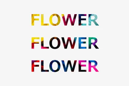
スライダー画像等、画面トップに表示する画像の読み込みに時間がかかってしまう場合、場合によっては一瞬画像が縦に並んでしまうことがあります。
その場合は時間稼ぎにローディング画面を一瞬表示させる方がよいかもしれません。
今回はローディングアニメーションを7パターン作成しましたので、ご参考になれば幸いです。
後半のパターンの方がコードが長くなりますが、難易度は低いですし、個人的にはお薦めしたいです。
ローディング画面を表示させず、画像の読込みを遅延する方法もあり
この記事のタイトルと真逆のことを先に述べておきます。
というのは、ローディング画面を実装した後に、やっぱり不要だったかもと後悔させてしまってはいけませんので。
Googleの画像読込み遅延技術(Google推奨)を使用する
ブラウザはChromeに限りますが、下記の例のように画像のタグに「loading=”lazy”」を追加すれば、画像の読込み遅延が実装可能になります。
<img src="image.jpg" loading="lazy" alt="image" width="●●●" height="●●●">但し、WordPress 5.5以降のバージョンであれば、画像のタグに「width属性」と「height属性」が記述されているものは、自動的に画像のタグに「loading=”lazy”」を追加してくれます。
プラグインを使用する場合
WordPressで有名なものであれば、「Native Lazyload(Google開発)」「Smush – Lazy Load Images, Optimize & Compress Images」あたりでしょうか。
画像読込み問題を解決してくれるかもしれません。
ローディング画面を表示する方法
ここからがこの記事の本題になります。
アニメーションは作成したけれど、ローディング画面の表示方法が分からなければ意味がありませんので、まずは表示方法からです。
HTMLファイル
これを基本としています。
<head>
  <!-- 省略 -->
  <link rel="stylesheet" href="style.css"> <!-- ご自身のパスに変更 -->
</head>

<body>
  <div id="loading-bg"> <!-- ローディング画面 -->
    <!-- ここにアニメーション要素を入れる -->
  </div>

<script src="https://cdnjs.cloudflare.com/ajax/libs/jquery/3.6.0/jquery.min.js"></script>
<script src="main.js"></script> <!-- ご自身のパスに変更 -->
</body>
CSSファイル
ローディング画面は、これを基本としています。
#loading-bg {
  position: fixed; /* ローディング画面をスクロールを不可にする */
  top: 0;
  left: 0;
  width: 100%;
  height: 100vh;
  background: #000;
  z-index: 10;
}
JSファイル
これを基本としており、以降に紹介する全てで共通のファイルです。
今回は、見やすいよう2秒(2000ミリ秒)経過後にローディング画面をフェードアウトしています。
しかし、もっと短くてもよい場合もあると思います。
画像読み込み速度や、ユーザーの感覚等を考慮した上で調整してください。
(もしくは、読み込みが完了したら表示する、という関数を追加する等、考えられます。)
CODEPENでもう一度ローディング画面を表示させたい場合は、「result」画面右下の「Rerun」ボタンを押してみてください。
setTimeout(function(){
  $('#loading-bg').fadeOut();
},2000); //2000ミリ秒後にフェードアウト
もし、全ての画像の読込みが完了してから実行したい場合は、以下のコードでfadeOutを実行してください。
$(window).on('load', function() {
  処理;
});
最もシンプル 円が回転(Font Awesome使用)
もし、Font Awesome未登録の方は、無料で利用可能なアイコンも豊富にありますので、利用してみてください。
Font Awesome のページで「Start for Free」を選択後、メールアドレスを登録します。
メール認証、パスワード設定と進んでいくと、コードが発行されますのでこれを使用します。
CODEPENで確認
See the Pen loading_circle_simple by blue moon (@blue-moon) on CodePen.
HTMLファイル
<head>
  <!-- 省略 -->
  <script src="https://kit.fontawesome.com/●●●●●●●●●●.js" crossorigin="anonymous"></script> <!-- ●●●部分にはご自身のfontawesomeのキーを入力 -->
  <link rel="stylesheet" href="style.css">  <!-- ご自身のパスに変更 -->
</head>
<body>
  <div id="loading-bg">
    <i class="fas fa-circle-notch fa-pulse"></i> <!-- 少し欠けた円のアイコンにfa-pulseを追記 -->
    <p>Loading...</p>
  </div>
  <div class="text">
    テキストテキストテキストテキストテキストテキストテキストテキストテキストテキスト。<br>
    テキストテキストテキストテキストテキストテキストテキストテキストテキストテキスト。<br>
    テキストテキストテキストテキストテキストテキストテキストテキストテキストテキスト。<br>
    テキストテキストテキストテキストテキストテキストテキストテキストテキストテキスト。
  </div>
  <script src="https://cdnjs.cloudflare.com/ajax/libs/jquery/3.6.0/jquery.min.js"></script>
  <script src="main.js"></script> <!-- ご自身のパスに変更 -->
</body>
補足説明
Font Awesomeのアイコンのタグ内で、「fa-pulse」を追加することで、アイコンをステップ回転しています。
CSSファイル
body {
  color: #444;
}

#loading-bg {
  position: fixed; /* 必須、ローディング画面をスクロールを不可にする */
  top: 0;
  left: 0;
  width: 100%;
  height: 100vh;
  background: #000;
  z-index: 10;
}

.fas {
  position: absolute;
  top: calc(50% - 20px);
  left: calc(50% - 20px);
  font-size: 40px;
  color: #fefefe;
}

p {
  position: absolute;
  top: calc(50% + 40px);
  left: 50%;
  margin: 0.5em auto;
  width: min-content;
  transform: translate(-50%, calc(-50% - 10px));
  color: #fefefe;
}

.text {
  margin: 30px auto;
  width: 80%;
  text-align: left;
}
これもシンプル 円を囲む矢印が回転 (Font Awesome使用)
よく見かけるアイコンで、ローディング中であることが一目で分かります。
しかし、他サイトの差別化は期待できないかもしれません。
CODEPENで確認
See the Pen loading_circle_arrow by blue moon (@blue-moon) on CodePen.
HTMLファイル
<!-- これより上は、前述のパターンと同じ -->
  <div id="loading-bg">
    <i class="fas fa-sync-alt fa-spin"></i> <!-- 2つの矢印で円を囲むアイコン -->
    <p>Loading...</p>
  </div>
<!-- これより下は、前述のパターンと同じ -->
補足説明
Font Awesomeのアイコンのタグ内で、「fa-spin」を追加することで、アイコンを滑らかに回転しています。
CSSファイル
前述のパターンと同じです。
自転車が一瞬走り抜ける (Font Awesome使用)
CODEPENで確認
See the Pen loading_bicycle by blue moon (@blue-moon) on CodePen.
HTMLファイル
<!-- これより上は、前述のパターンと同じ -->
  <div id="loading-bg">
    <i class="fas fa-bicycle"></i> <!-- 自転車のアイコン -->
    <p>Loading...</p>
  </div>
<!-- これより下は、前述のパターンと同じ -->
CSSファイル
/* これより上は、前述のパターンと同じ */
.fas {
  position: absolute;
  top: calc(50% - 20px);
  font-size: 40px;
  color: #fefefe;
  animation: ride 2s ease-in-out;  /* アニメーション時間とローディング表示時間を合わせています */
}

@keyframes ride {
  from { left: 0%; }
  to { left: 100%; }
}
/* これより下は、前述のパターンと同じ */
横一列に並んだ円が順に弾む
CODEPENで確認
See the Pen loading_circles by blue moon (@blue-moon) on CodePen.
HTMLファイル
<!-- これより上は、前述のパターンと同じ -->
  <div id="loading-bg">
    <div class="circle">
      <span></span> <!-- これらのspanタグに円を作成 -->
      <span></span>
      <span></span>
      <span></span>
      <span></span>
    </div>
    <p>Loading...</p>
  </div>
<!-- これより下は、前述のパターンと同じ -->
CSSファイル
/* これより上は、前述のパターンと同じ */
.circle {
  position: absolute;
  top: 50%;
  left: 50%;
  transform: translate(-50%, -50%);
}

span {
  display: inline-block;  /* アニメーションするため */
  padding: 5px;
  width: 15px;
  height: 15px;
  border-radius: 50%;
  background: #fefefe;
}

span:nth-child(1) {
  animation: circleAnim 0.5s ease-in-out infinite;
}

span:nth-child(2) {
  animation: circleAnim 0.5s ease-in-out infinite 0.05s;
}

span:nth-child(3) {
  animation: circleAnim 0.5s ease-in-out infinite 0.1s;
}

span:nth-child(4) {
  animation: circleAnim 0.5s ease-in-out infinite 0.15s;
}

span:nth-child(5) {
  animation: circleAnim 0.5s ease-in-out infinite 0.2s;
}

@keyframes circleAnim {
  0% { transform: translateY(0); }
  50% { transform: translateY(-30px); }
  100% { transform: translateY(0); }
}

p {
  position: absolute;
  top: calc(50% + 30px);
  left: 50%;
  margin: 0.5em auto;
  width: min-content;
  transform: translate(-50%, calc(-50% - 15px));
  color: #fefefe;
}
/* これより下は、前述のパターンと同じ */
補足説明
spanタグのアニメーション実行遅延(animationプロパティの値の最後の●sの部分)を少しずつ(0.005秒)ずらすことで、一列に並んだ円が波打つような動きになっています。
アニメーションする要素(ここでは、spanタグ)がインライン要素である場合、transformプロパティが効かないため、ご注意ください。
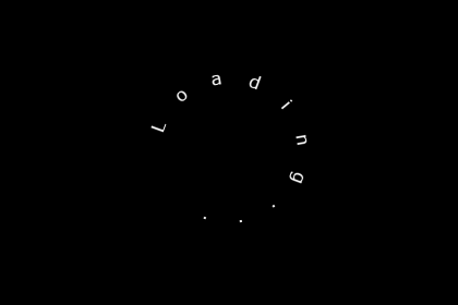
「Loading…」文字が一文字ずつ順に表示
といっても、全ての文字は完全に非表示にしておらず、不透明度を下げて読みやすくしています(ローディング画面は一瞬のため)。
CODEPENで確認
See the Pen loading_opacity by blue moon (@blue-moon) on CodePen.
HTMLファイル
<!-- これより上は、前述のパターンと同じ -->
  <div id="loading-bg">
    <div class="loading">
      <span>L</span>
      <span>o</span>
      <span>a</span>
      <span>d</span>
      <span>i</span>
      <span>n</span>
      <span>g</span>
      <span>.</span>
      <span>.</span>
      <span>.</span>
    </div>
  </div>
<!-- これより下は、前述のパターンと同じ -->
CSSファイル
/* これより上は、前述のパターンと同じ */
.loading {
  position: absolute;
  top: 50%;
  left: 50%;
  margin: 0 auto;
  transform: translate(-50%, -50%);
  color: #fefefe;
}

span:nth-child(1) {
  animation: letterAnim 0.6s ease-in-out infinite;
}

span:nth-child(2) {
  animation: letterAnim 0.6s ease-in-out infinite 0.05s;
}

span:nth-child(3) {
  animation: letterAnim 0.6s ease-in-out infinite 0.1s;
}

span:nth-child(4) {
  animation: letterAnim 0.6s ease-in-out infinite 0.15s;
}

span:nth-child(5) {
  animation: letterAnim 0.6s ease-in-out infinite 0.2s;
}

span:nth-child(6) {
  animation: letterAnim 0.6s ease-in-out infinite 0.25s;
}

span:nth-child(7) {
  animation: letterAnim 0.6s ease-in-out infinite 0.3s;
}

span:nth-child(8) {
  animation: letterAnim 0.6s ease-in-out infinite 0.35s;
}

span:nth-child(9) {
  animation: letterAnim 0.6s ease-in-out infinite 0.4s;
}

span:nth-child(10) {
  animation: letterAnim 0.6s ease-in-out infinite 0.45s;
}

@keyframes letterAnim {
  0% { opacity: 1; }
  50% { opacity: 0.2; }
  100% { opacity: 1; }
}
/* これより下は、前述のパターンと同じ */
「Loading…」文字が一文字ずつ順に弾む
CODEPENで確認
See the Pen loading_letter_bounce by blue moon (@blue-moon) on CodePen.
HTMLファイル
前述のパターンと同じです。
CSSファイル
/* これより上は、前述のパターンと同じ */
span {
  display: inline-block;
}

span:nth-child(1) {
  animation: bounceAnim 1s ease-in-out infinite;
}

span:nth-child(2) {
  animation: bounceAnim 1s ease-in-out infinite 0.05s;
}

span:nth-child(3) {
  animation: bounceAnim 1s ease-in-out infinite 0.1s;
}

span:nth-child(4) {
  animation: bounceAnim 1s ease-in-out infinite 0.15s;
}

span:nth-child(5) {
  animation: bounceAnim 1s ease-in-out infinite 0.2s;
}

span:nth-child(6) {
  animation: bounceAnim 1s ease-in-out infinite 0.25s;
}

span:nth-child(7) {
  animation: bounceAnim 1s ease-in-out infinite 0.3s;
}

span:nth-child(8) {
  animation: bounceAnim 1s ease-in-out infinite 0.35s;
}

span:nth-child(9) {
  animation: bounceAnim 1s ease-in-out infinite 0.4s;
}

span:nth-child(10) {
  animation: bounceAnim 1s ease-in-out infinite 0.45s;
}

@keyframes bounceAnim {
  0% {
    animation-timing-function: ease-in;
    transform: translateY(-45px);
  }
  40% {
    animation-timing-function: ease-in;
    transform: translateY(-24px);
  }
  65% {
    animation-timing-function: ease-in;
    transform: translateY(-12px);
  }
  82% {
    animation-timing-function: ease-in;
    transform: translateY(-6px);
  }
  93% {
    animation-timing-function: ease-in;
    transform: translateY(-4px);
  }
  25%, 55%, 75%, 87% {
    animation-timing-function: ease-out;
    transform: translateY(0px);
  }
  100% {
    animation-timing-function: ease-out;
    transform: translateY(0px);
  }
}
/* これより下は、前述のバージョンと同じ */
円形の「Loading…」文字が回転する
CODEPENで確認
See the Pen loading_letter_rotate by blue moon (@blue-moon) on CodePen.
HTMLファイル
<!-- これより上は、前述のパターンと同じ -->
  <div id="loading-bg">
    <div class="loading">
      <div class="circle">
        <span>L</span>
        <span>o</span>
        <span>a</span>
        <span>d</span>
        <span>i</span>
        <span>n</span>
        <span>g</span>
        <span>.</span>
        <span>.</span>
        <span>.</span>
      </div>
    </div>
  </div>
<!-- これより下は、前述のパターンと同じ -->
CSSファイル
/* これより上は、前述のパターンと同じ */
.circle {
  position: relative;
  width: 100px;
  height: 160px;
}

span {
  /* border: solid 1px #808080; */  /* ここを入れてみると文字の回転の仕組みが理解できる */
  /* box-sizing: border-box; */
  position: absolute;
  display: inline-block;
  top: 0;
  left: calc(50% - 10px);;
  width: 20px;
  height: 80px;
  font-size: 16px;
  text-align: center;
  transform-origin: bottom center;
}

span:nth-child(1) {
  animation: letterRotate1 1s ease-in-out infinite;
}

@keyframes letterRotate1 {
  0% { transform: rotate(0deg); }
  100% { transform: rotate(300deg); }
}

span:nth-child(2) {
  animation: letterRotate2 1s ease-in-out infinite;
}

@keyframes letterRotate2 {
  0% { transform: rotate(30deg); }
  100% { transform: rotate(330deg); }
}

span:nth-child(3) {
  animation: letterRotate3 1s ease-in-out infinite;
}

@keyframes letterRotate3 {
  0% { transform: rotate(60deg); }
  100% { transform: rotate(360deg); }
}

span:nth-child(4) {
  animation: letterRotate4 1s ease-in-out infinite;
}

@keyframes letterRotate4 {
  0% { transform: rotate(90deg); }
  100% { transform: rotate(390deg); }
}

span:nth-child(5) {
  animation: letterRotate5 1s ease-in-out infinite;
}

@keyframes letterRotate5 {
  0% { transform: rotate(120deg); }
  100% { transform: rotate(420deg); }
}

span:nth-child(6) {
  animation: letterRotate6 1s ease-in-out infinite;
}

@keyframes letterRotate6 {
  0% { transform: rotate(150deg); }
  100% { transform: rotate(450deg); }
}

span:nth-child(7) {
  animation: letterRotate7 1s ease-in-out infinite;
}

@keyframes letterRotate7 {
  0% { transform: rotateZ(180deg); }
  100% { transform: rotateZ(480deg); }
}

span:nth-child(8) {
  animation: letterRotate8 1s ease-in-out infinite;
}

@keyframes letterRotate8 {
  0% { transform: rotate(210deg); }
  100% { transform: rotate(510deg); }
}

span:nth-child(9) {
  animation: letterRotate9 1s ease-in-out infinite;
}

@keyframes letterRotate9 {
  0% { transform: rotate(240deg); }
  100% { transform: rotate(540deg); }
}

span:nth-child(10) {
  animation: letterRotate10 1s ease-in-out infinite;
}

@keyframes letterRotate10 {
  0% { transform: rotate(270deg); }
  100% { transform: rotate(570deg); }
}
/* これより下は、前述のパターンと同じ */
補足説明
あえてコメントアウトで掲載している箇所を、コメントアウトを解除すると、円形レイアウトの仕組みが理解しやすいと思います。
なぜ、spanタグの高さが高いのか。この高さがほぼ円形の半径となります。厳密には、文字の大きさが含まれてしまっていますが。
また、「Loading…」の文字の最初と最後の文字の間隔を空けたくない場合は、@keyframeで角度を30度ずつ増やしている箇所を調整してください。
今回は、spanタグ10個で、角度300度分しか文字が埋めておらず、60度分最初と最後の文字に隙間がある状態です。
注意点としては、@keyframeで、「390deg」等大きな角度になっている箇所を、同じ角度でもマイナス表記「-30deg」としてしまうと、反時計回りになってしまいますので、ご注意ください。
ローディング画面がめくれる
CODEPENで確認
See the Pen loading_turn over by blue moon (@blue-moon) on CodePen.
HTMLファイル
<!-- これより上は、前述のパターンと同じ -->
  <div id="loading-bg">
    <div class="gradation"></div>
    <p>Loading...</p>
  </div>
<!-- これより下は、前述のパターンと同じ -->
CSSファイル
body {
  color: #444;
  background-color: #fefefe; /* 本来のbodyの色 */
}

#loading-bg {
  position: fixed;
  top: 0;
  left: 0;
  width: 100%;
  height: 100vh;
  background: #a9a9a9;
  z-index: 10;
  animation: bgrote 10s linear infinite;
}

.gradation {
  position: absolute;
  top: 0%;
  left: 0%;
  width: 20px;
  height: 20px;
  background-image: linear-gradient(-45deg, #fff 0%, #f5f5f5 20%, #555 50%, #fff 50% 100%);
  filter: drop-shadow(1px 1px 2px black);
  animation: turnOver 2s linear forwards;
  transform-origin: top left;
}

@keyframes turnOver {
  0% { transform: scale(0); }
  100% { transform: scale(5); }
}

p {
  position: absolute;
  top: 50%;
  left: 50%;
  margin: 0.5em auto;
  width: min-content;
  transform: translate(-50%, -50%);
  color: #fefefe;
  animation: blink 2s ease-in-out infinite;
}

@keyframes blink {
  0% { opacity: 1; }
  25% { opacity: 0; }
  50% { opacity: 1; }
  75% { opacity: 0; }
  100% { opacity: 1; }
}

/* これより下は、前述のパターンと同じ */
補足説明
最初に、ローディング画面の左上に正方形を作成し、これにグラデーションをつけることでページがめくれかけているイメージを作成しています。
この正方形をローディング画面が消える時間まで適度な大きさに拡大していきます。
この時、拡大する時の起点を指定(transform-origin: top left)しないと、この正方形の中点を中心に拡大してしまい不自然になります。
因みに、グラデーションの記述方法については下記のページでも紹介していますので、ご参考までに。