
先日の記事で、文字を円形に自動で配置する方法を紹介しています。
今回は、その円形にしたものを3D上で回転させてみました。
水平、垂直、斜めパターン作成しています。
ここでは、テキストは文字の集まり(文章または単語)、文字はそれを構成する1文字ずつのこととして区別しています(もし混同している箇所がありましたらすみません)。
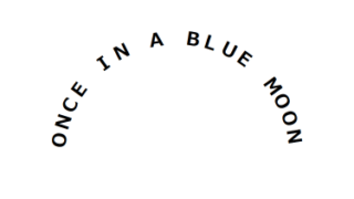
テキストを水平方向の円形にし3D回転
CODEPEN
「Run Pen」をクリックしてください。
See the Pen horizontal_3dCircle_rotate by blue moon (@blue-moon) on CodePen.
HTMLファイル
<body>
  <div class="circle">
    <div class="inner"> <!-- 文字配置の基準となる親要素 -->
      <p class="text">ONCE IN A BLUE MOON </p>
    </div>
  </div>
  <script src="https://ajax.googleapis.com/ajax/libs/jquery/3.6.0/jquery.min.js"></script>
  <script src="main.js"></script> <!-- ご自身のパスに -->
</body>
空白の特殊記号が既に変換されて表示されていると思いますが、もともと空白は「 」と記述しています。
CSSファイル
body {
  font-size: 20px;
}

.circle {
  margin: 0 auto;
  width: 200px;  /* 円の直径となるため、文字数により調整 */
  height: 200px;  /* 円の直径となるため、widthと同じ値に */
  display: flex;
  justify-content: center;
  align-items: center;
  transform: translateY(-60px);  /* 元々平面では直径200pxの円を90度倒した分、上下に余白が発生。余白を詰める */
}

.inner {
  transform-style: preserve-3d;  /* 子要素を3D空間に */
  transform: rotateX(-90.1deg) rotateZ(120deg);  /* 調整 */
}

.text {
  margin: 0;
  transform-style: preserve-3d;  /* 子要素を3D空間に */
  animation: rotateAnim linear infinite;
  animation-duration: 7s;  /* animationプロパティで一括指定していない */
}

@keyframes rotateAnim {  /* 回転方向に注意、0%と100%を同じ引数にすると、途中で逆再生になる */
  0% { transform: rotate(360deg); }
  50%{ transform: rotate(180deg); }
  100% { transform: rotate(0deg); }
}

span {
  position: absolute;
  inset: 0;  /* top, right, bottom, leftを一括指定 */
  font-weight: 700;
  opacity: 0;  /* 最初に表示される時に全て見えてしまうため */
  animation: opacityAnim 7s linear infinite;  /* アニメーション時間はテキストの回転アニメーション時間と合わせる */
}

@keyframes opacityAnim {
  0%, 50%, 100% { opacity: 0.2; }  /* 文字が両端に来た時 */
  25% { opacity: 1; }  /* 文字が一番手前(正面)に来た時 */
  75%{ opacity: 0; }  /* 文字が裏面に来た時 */
}
補足説明
クラス名 inner
「transform-style: preserve-3d;」は、この子要素でも記述しています。
このプロパティは孫要素に引き継がれないため、都度設定する必要があります。
MDN CSS カスケーディングスタイルシート transform-style
transformプロパティのrotateXでぴったり-90degにすると、画面と完全に垂直となり、見えなくなってしまうため、-90.1degとしていまう。あるいは、-89.9degでもよいかと思います。
0.1度くらいでは見た目は気づかないと思います。
rotateZで、円の中でのテキストの開始地点を調整しています。
クラス名 text
animation-durationプロパティは、animationプロパティ内で一括指定することもできますが、敢えて別に記述しています。
その理由は、jQueryでanimation-durationプロパティの値を取得するためです。
もちろん、まとめて記載しjQueryの方でが直接その値を記述してもよいと思いますが、一貫性を保つためにこのようにしています。
spanタグ
opacityプロパティの初期値を0にしているのは、ページ表示直後、3D上で背面に位置する文字まで見えてしまうと、手前の文字と重なって見えづらくなるためです。
よって、ページ表示直後のみ(アニメーションが始まる前)、一文字ずつ出現するようになりますが、その後は文字が背面にいくにつれて透過させるアニメーションが継続されます。
JSファイル
const before = $('.text');
const text = before.text(); // 文字をspanタグで囲む前のテキストを取得
const textArray = text.split('');  // 取得したテキストを1文字ずつに分割し配列にして変数に格納

let after = '';
$.each(textArray,function(index,val){ // 配列の各文字をspanタグで囲み、繋げていく
  after += "<span>" + val + "</span>";
});

before.html(after);  // 元のテキストに生成したタグごと置き換え

const textcnt = textArray.length;
const circleR = ($('.circle').height()) / 2; // 円の半径
const fontH = ($('.inner').height());
const dist = circleR - fontH;
const animTime = $('.text').css('animation-duration').slice(0, -1);  // アニメーション時間を取得し、「s」を切り捨て

$('span').each(function(index) {
  const num = index + 1;
  const radX = Math.sin(360 / textcnt * num * (Math.PI / 180)); // 文字の中心からのX軸方向の移動距離を計算
  const radY = Math.sin((90 - (360 / textcnt * num)) * (Math.PI / 180)); // 文字の中心からのY軸方向の移動距離(実際にはマイナス移動)を計算
  $(this).css({'transform': 'translate(' + dist * radX + 'px, ' + -(dist * radY) + 'px) rotateX(90deg) rotateY(' + 360 / textcnt * num + 'deg)', //1文字ずつ円形に等間隔で円形に配置
               'animation-delay': animTime / textcnt * num + 's', // 1文字ずつアニメーション開始時間を遅延
                });  //
});
【参考】出力されるHTML
円形配置とアニメーション開始遅延の関数により、出力されるHTMLは下記のようになります。
<div class="circle">
    <div class="inner">
      <p class="text">
        <span style="transform: translate(30.9017px, -95.1057px) rotateX(90deg) rotateY(18deg); animation-delay: 0.35s;">O</span>
        <span style="transform: translate(58.7785px, -80.9017px) rotateX(90deg) rotateY(36deg); animation-delay: 0.7s;">N</span>
        <span style="transform: translate(80.9017px, -58.7785px) rotateX(90deg) rotateY(54deg); animation-delay: 1.05s;">C</span>
        <span style="transform: translate(95.1057px, -30.9017px) rotateX(90deg) rotateY(72deg); animation-delay: 1.4s;">E</span>
        <span style="transform: translate(100px, 0px) rotateX(90deg) rotateY(90deg); animation-delay: 1.75s;"> </span>
        <span style="transform: translate(95.1057px, 30.9017px) rotateX(90deg) rotateY(108deg); animation-delay: 2.1s;">I</span>
        <span style="transform: translate(80.9017px, 58.7785px) rotateX(90deg) rotateY(126deg); animation-delay: 2.45s;">N</span>
        <span style="transform: translate(58.7785px, 80.9017px) rotateX(90deg) rotateY(144deg); animation-delay: 2.8s;"> </span>
        <span style="transform: translate(30.9017px, 95.1057px) rotateX(90deg) rotateY(162deg); animation-delay: 3.15s;">A</span>
        <span style="transform: translate(1.22465e-14px, 100px) rotateX(90deg) rotateY(180deg); animation-delay: 3.5s;"> </span>
        <span style="transform: translate(-30.9017px, 95.1057px) rotateX(90deg) rotateY(198deg); animation-delay: 3.85s;">B</span>
        <span style="transform: translate(-58.7785px, 80.9017px) rotateX(90deg) rotateY(216deg); animation-delay: 4.2s;">L</span>
        <span style="transform: translate(-80.9017px, 58.7785px) rotateX(90deg) rotateY(234deg); animation-delay: 4.55s;">U</span>
        <span style="transform: translate(-95.1057px, 30.9017px) rotateX(90deg) rotateY(252deg); animation-delay: 4.9s;">E</span>
        <span style="transform: translate(-100px, 1.22465e-14px) rotateX(90deg) rotateY(270deg); animation-delay: 5.25s;"> </span>
        <span style="transform: translate(-95.1057px, -30.9017px) rotateX(90deg) rotateY(288deg); animation-delay: 5.6s;">M</span>
        <span style="transform: translate(-80.9017px, -58.7785px) rotateX(90deg) rotateY(306deg); animation-delay: 5.95s;">O</span>
        <span style="transform: translate(-58.7785px, -80.9017px) rotateX(90deg) rotateY(324deg); animation-delay: 6.3s;">O</span>
        <span style="transform: translate(-30.9017px, -95.1057px) rotateX(90deg) rotateY(342deg); animation-delay: 6.65s;">N</span>
        <span style="transform: translate(-2.44929e-14px, -100px) rotateX(90deg) rotateY(360deg); animation-delay: 7s;"> </span></p>
    </div>
  </div>
文字の配置方法
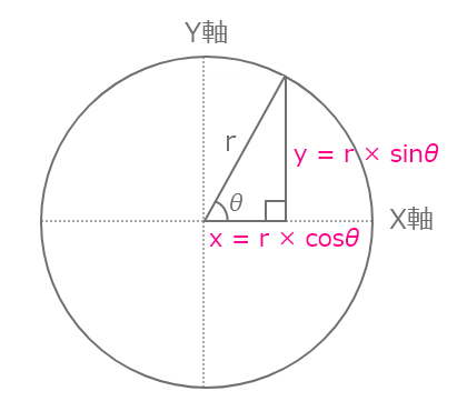
文字の配置方法やそれに関わる計算方法の仕組みは、下記の記事をご参考にしてください。
下記のように、三角関数やcosθ等が出てきます。
テキストを垂直方向の円形にし3D回転
CODEPEN
「Run Pen」をクリックしてください。
See the Pen vertical_3dCircle_rotate by blue moon (@blue-moon) on CodePen.
HTMLファイル
元のHTMLは前述のパターンと同じです。 出力されるHTMLは異なります。
CSSファイル
/* これより上省略、円の大きさやmarginは前述より変更しています */

.inner {
  transform-style: preserve-3d;  /* 子要素を3D空間に */
  transform: rotateY(90.2deg) rotateZ(120deg);  /* ぴったり90degではない、90.1度では見えない文字が出てくるため調整 */
}

.text {
  /* 途中省略 */
  animation-duration: 6s;
}

@keyframes rotateAnim { /* 前述のパターンと同じ */
  /* 途中省略 */
}

span {
  /* 途中省略 */
  text-orientation: upright;  /* テキストの向きを設定 */
  writing-mode: vertical-rl;  /* テキストの行のレイアウトの向きを設定 */
  animation: opacityAnim 6s linear infinite;;
}

@keyframes opacityAnim { /* テキストのスタート地点によって、どの地点で透過度を1にするか調整 */
  0%, 100% { opacity: 1; }
  25%, 75% { opacity: 0.2; }
  50% { opacity: 0; }
}
補足説明
span
アルファベットを縦に並べると、各文字の幅が異なるため中央揃えになりません。「I」の文字が左寄りになってしまいます。
そこで、text-orientationプロパティとwriting-modeをセットで設定することで、中央揃えにしています。
MDN CSS カスケーディングスタイルシート text-orientation
これ以外で、前述のパターンと大きな違い(新しく設定したプロパティ)はないと思います。
JSファイル
// これより上は前述と同じため省略

$('span').each(function(index) {
  const num = index + 1;
  const radX = Math.sin(360 / textcnt * num * (Math.PI / 180));
  const radY = Math.sin((90 - (360 / textcnt * num)) * (Math.PI / 180));
  $(this).css({'transform': 'translate(' + dist * radX + 'px, ' + -(dist * radY) + 'px) rotateY(-90deg) rotateX(' + (360 / textcnt * num - 90) + 'deg)',
               'animation-delay': animTime / textcnt * num + 's',
                });
});
補足説明
前述のパターンと異なる点は、cssメソッドの引数です。
少し複雑になっていますが、ここで文字を円形配置するとともに、テキストを縦方向にしています。
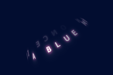
テキストを斜め方向の円形にし3D回転
CODEPEN
「Run Pen」をクリックしてください。
See the Pen oblique_3dCircle_rotate by blue moon (@blue-moon) on CodePen.
HTMLファイル
元のHTMLは最初の水平方向のパターンと同じです。 出力されるHTMLは異なります。
CSSファイル
body {
  background: #020d30; /* 文字の発光が映えるような暗めの紺色 */
  font-size: 20px;
  color: #fff;
}

.circle {
  /* 途中省略 */
  transform: rotate(-30deg);  /* テキスト全体を斜めに、角度はお好みで */
}

.inner {
  transform: rotateX(260deg) rotateZ(90deg) /* Xで前面と背面のテキスト列をずらし、より立体感を演出。Zはテキストの開始地点 */
  transform-style: preserve-3d;  /* 子要素を3D空間に */
}

.text {
  margin: 0;
  transform-style: preserve-3d;  /* 子要素を3D空間に */
  perspective: 250px;   /* 遠近感を設定(視点を操作)、これによりテキスト全体の円が上から下に広がって見える */
  animation: rotateAnim linear infinite;
  animation-duration: 7s;
}

  /* 途中省略 */

span {
  /* 途中省略 */
  animation: opacityAnim 7s linear infinite;
}

@keyframes opacityAnim {  /* 透過度との発光の度合いを調整 */
  0%, 50%, 100% {
    opacity: 0.3;
    text-shadow: 0 0 3px #ff1cac,  /* あざやかな赤紫系の色 */
                 0 0 5px #ffb3e3, /* shadowを重ね、より発光のニュアンスを調整。色は淡い赤紫系の色 */
                 0 0 10px rgba(255,255,255,0.7);  /* 白に透明度を追加 */
  }
  25% { /* 正面の位置あたりで透過度を1に、ここに向かってよりshadowを大きく */
    opacity: 1;
    text-shadow: 0 0 7px #ff1cac,
                 0 0 10px #ffb3e3,
                 0 0 22px rgba(255,255,255,0.8);
  }
  75%{
    opacity: 0;
    text-shadow: 0 0 1px #ff1cac,
                 0 0 3px #ffb3e3,
                 0 0 5px rgba(255,255,255,0.7);
  }
}
補足説明
元となっているのは、最初の水平方向のパターンです。
大きく異なる点は、全体を斜めにしperspectiveプロパティで視点を操作することで、より立体感を演出しています。
それに加え、背景色、文字色と文字のアニメーションを変更しています。
perspectiveプロパティは値が小さくなる程、視点が近くなり遠近感が出ます。
MDN CSS カスケーディングスタイルシート perspective
JSファイル
最初の水平方向のパターンと同じです。